PORTFOLIO
Wayne Thiebaud Painting
Artist Style Painting Critique
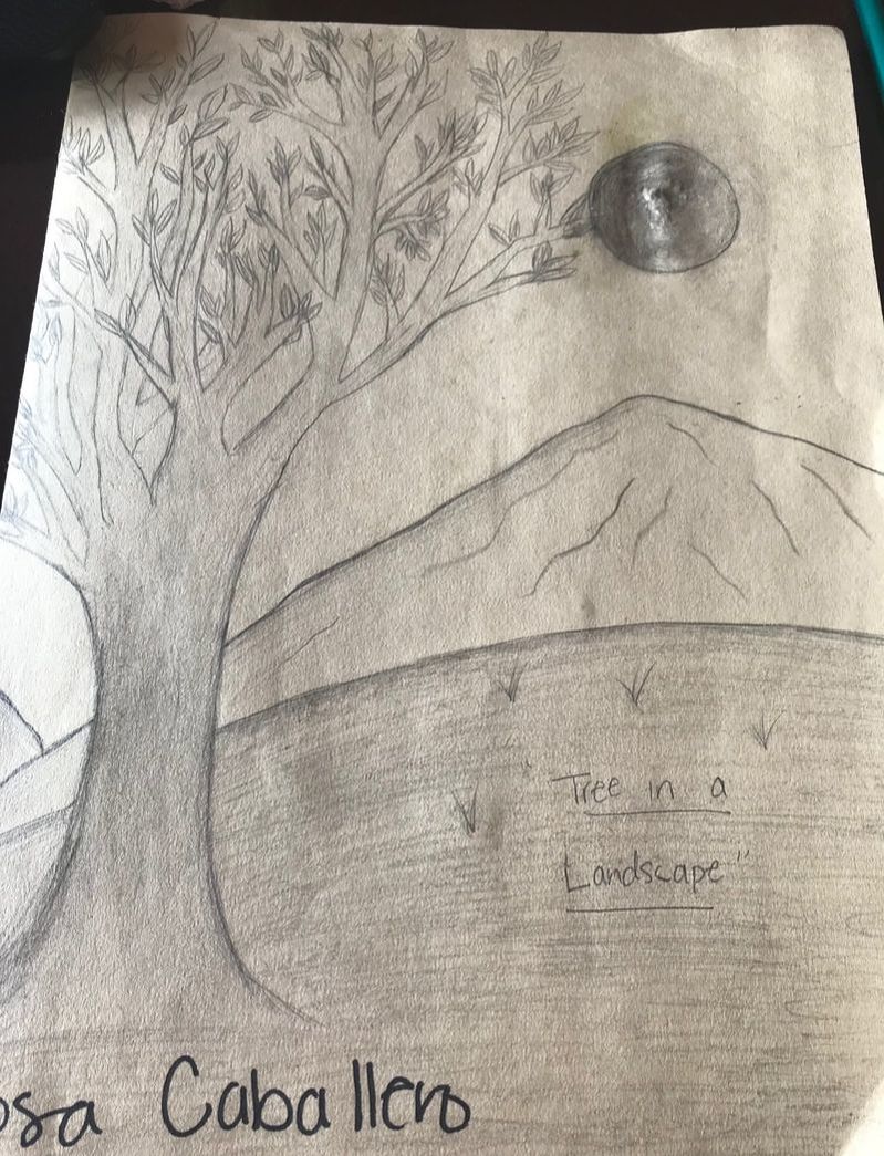
Landscape in the style of an artist critique
Self Evaluation
1. Who was your referenced artist for the painting? Name 4 main ideas you used from your research to create your painting.
Name- Wayne Thiebaud
1. Thick paint
2. bright colors strong contrast between dark and light shadows
3. repetition
4. plain light backgrounds
2. Describe the craftsmanship of your painting. (Is it neat and well executed?) I think that my painting is well executed but I feel like it could have been neater. Since I somewhat was anxious to finish it and had the pressure of finishing it the night before we had to do our presentation Friday. Either way I'm happy the way it turned out and feel pretty accomplished. To me it's neat enough to hang on a wall in my room.
3. What was the most difficult part of this project?
The mos difficult part of this project was attempting to trace my outline of the Arizona can for my painting with carbon fiber painting. This part was really difficult because the carbon fiber I was using to trace the can kept on moving out of place so the traced drawing was not consistent and messed up. I eventually just had to draw most of the cans three times, since only some letters on the can and the outline of the can were the only parts that printed well on the canvas.
4. Describe your color choices and how they reflect the work of your chosen artist?
My color choices were bright colors, they reflect the work of my chosen artist because he mostly used bright colors. For the background I used a light pastel like pink and and white because most of his pop art paintings had plain white backgrounds. I tried to not use black paint throughout my painting because the only darker colors Thiebaud used were for shadows which he didn't use black for but instead deep intense blues or purples.
5. Describe how the style of your painting reflects your chosen artist.
The style of my painting reflects my chosen artist through the use of the thick paint that I used for the background and some areas that I attempted to do so on the Arizona cans. As well as the color selection and the intense shadows I put into my painting. My color selection being bright colors and avoiding black. The intense shadows, which have a strong contrast between the light and the dark of the background and the painting.
6. What do you think your chosen artist would say if he or she could see your painting today?
I think that my artist would probably recognize that my painting was inspired by him and would maybe feel like it is a good imitation of his style and pop art paintings.
7. What would you do differently if you were to do this project again?
If I were to do this project again I would have still chosen to paint Arizona cans since to me they have an aesthetic design and were interesting to paint. It was a bit challenging but interesting. If I were to do this project again I would probably just try to make the branches displayed on the can lighter as well as the flowers but either way not all of Wayne Thiebaud's paintings were drawn extremely sharp so I think it worked well.
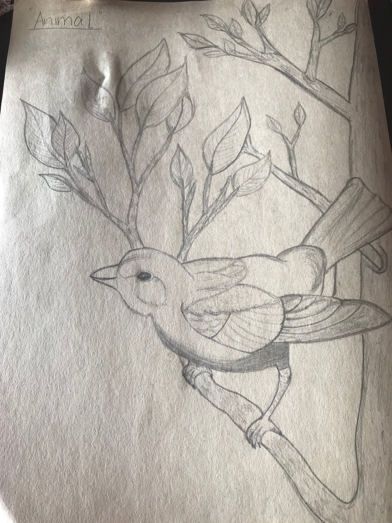
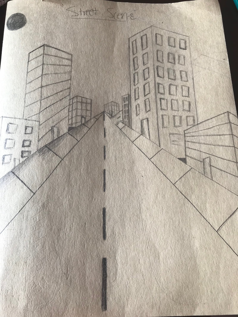
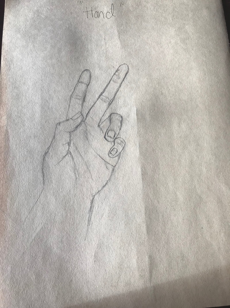
Painting
Clay Food Project
Clay Food Project Critique Questions
1. Describe the craftsmanship of your sculpture. (Is it neat and well executed?)
The colors that I used were yellow, pink and white, they did work together harmoniously because the sculptures look real, and those are the actual colors this type of bread can be found in. I used a light yellowish brownish color for the bread part of my sculpture to make the pieces look the most realistic possible.
4. Is your sculpture interesting from all views?
8. What would you do differently if you were to do this project again?
- The craftsmanship of my sculpture I think was exceptional. I really took the time to add the appropriate texture and to smooth out the parts of my piece that had to be smooth. I tried to make it as neat as possible by going over the same areas over and over with small tools such as q-tips to reach even the smallest places in my piece. The finalized conchas do look very similar to conchas in real life which I think proves my craftsmanship was well executed. The colors also mostly match the colors of a real life concha making it appear more realistic.
- I think that the most difficult part of the project was trying to achieve the appropriate texture, to really replicate the real food. Since my food was bread I had a really hard time trying to get the sugar sections of the bread to look crusty. I ended up just trying to add dents to somewhat achieve that look, I also added some lines to achieve that look.
The colors that I used were yellow, pink and white, they did work together harmoniously because the sculptures look real, and those are the actual colors this type of bread can be found in. I used a light yellowish brownish color for the bread part of my sculpture to make the pieces look the most realistic possible.
4. Is your sculpture interesting from all views?
- Yes, I think overall my sculpture is interesting from all views. From anywhere you look at it you can see the texture as well as feel it. It is consistent all around. I tried to make every part of the conchas look real in order to really tie the project together, and make it look realistic.
- When constructing a sculpture you have to actually use your hands to physically shape your project, when it's something 2D all you have is pencil and paper to make your project. When doing a 2D project it is more flat and there isn't as much to it as there is to a sculpture. In a sculpture you have to worry about the whole thing and not just one side or one perspective. When doing a sculpture you have to use tools to apply textures to your sculpture, you also have to make the proportions of the sculpture as similar as possible to what you are trying to replicate. In a 2D project you only have to have appropriate proportions as well, but it is not as difficult because you don't have to actually sculpt it, but instead just draw it and use value to make it appear that way.
- I created the texture on the "sugar" part of my conchas by using the sticks on the Q-tips to make dents on that parts of my sculpture. I also used the tips of the Q- tips to smooth out the parts in between the "sugar" pieces of the conchas. Before using them, I applied water on them and then smoothed the rough parts of the sculpture.
- Yes, I think that my sculpture looks very similar to the actual food because of the texture I created and the actual size I made them, which are the sized they are made in real life. I think that the colors I used, the yellow, white and the pink, as well as the color I created for the bread part of the conchas really make them look real.
8. What would you do differently if you were to do this project again?
- I would have just done a vairety of the types of bread, like I first had in mind. The reason I didn't do that was because, I felt like I did not have enough time to do so. Which is why I ended up just doing the same types of bread, conchas, but in different sizes. I would have also tried to mix the brown a little lighter because I feel like the conchas are a bit dark.
Self Portrait
Self Portrait Critique Questions
1. Describe the craftsmanship of your portrait. (Is it neat and well executed?)
- Yes, I think that it is neat and well executed. I definitely had a lot of patience during this project but it was worth it because it does look like I took my time and tried to replicate exactly what I saw by drawing the portrait square by square. I think you can see the craftsmanship of my portrait in the details of it such as some of the highlights from the sun in my face and the details in my sweater.
- I had a lot of difficulties at first when I was trying to make a color that matched my skin color because I didn't want it to look orange or unnatural. My neck turned out to be much darker than my face, because I blended it to much so I had to fix it by layering on more color to my face to make it match or at least darker.
- Yes, I did draw each grid box separately. It is important to do this because it lets you know exactly where to place everything in your portrait. Especially your features because if you don't do that your face will look off or might look malformed.
- I created value changes with my colored pencils by adding more layers to the darker areas of the portrait as well as using more of the darker colored pencil which was blue. I also created darker colors by putting more pressure on the colored pencils where I wanted it to be darker and less pressure where I wanted it to be lighter. I used more yellows or the white of the paper in the areas that I wanted to be the lightest.
- I was able to get the color I wanted from the three colored pencils by mixing them. Fore example for shadows in my sweater I used blue and red to make a dark purple that looked like black. For my skin tone I mixed red and yellow to make a peachy colored skin tone which I thought matched the photo I was replicating the best.
- I think I could improve my portrait by adding more value to my drawing which I think would make it more three-dimensional and realistic. I also think I could have improved on the mixing of my colors for my skin tone and hair to try to get it closer to what it looked like in the picture. Also I feel like I could have used more pressure because to me the portrait looks a bit washed out. Maybe I could've even added a bit more detail to my eyebrows, by adding tiny stoked of hair, to make it more realistic.
- I think I wasn't really prepared at all for this project because we didn't really do much practice which I think would have been need a lot of for this project because at least I think it was challenging. It was challenging because we didn't really practice drawing eyes or a mouth or a nose before hand which I think would of made drawing my self portrait much faster and easier. I think that the part of this unit that was beneficial was when we tried to replicate what we cut out of a magazine and draw it because that's what I feel like we had to do for this project as well.
- Another classmates peace that I think was an excellent example of mastering the techniques was Marelena's drawing it was really detailed and looked exactly like her photo, it turned out beautiful. All of the colors she used were blended out perfectly and all of her proportions were exact. Her colors were also almost exact to her photograph which is very difficult to achieve. I could also tell she followed directions of working square by square because you could see each individual square in her portrait.
Colored Pencil Practice
Guest Watercolor Project
Guest Artist Watercolor Critique Questions
1. Explain the process you had to use to create the poured watercolor painting.
- To create the poured watercolor painting I had to use the same repetitive process throughout. The first step was to apply masking fluid to the area that I wanted to remain completely white in the painting. The second step was to apply more masking fluid after adding the first layer of watercolor to the drawing. Once I was satisfied with the color and value of an area I applied masking fluid to that area to keep it the same. For the rest I just kept adding more layers of watercolor to create a darker value until it reached the desired color. Lastly, I applied masking fluid over the entire piece once I thought I had achieved the desired colors and values I wanted.
- Some difficulties I had in this process where choosing the colors I wanted to add in each part of the piece. This was difficult for me because I didn't want the colors to mix into a color that would turn brown or just any color that would ruin my piece. Another difficulty was spreading the colors while moving the clipboard. This was difficult because since the paper was really runny because of the water sprayed on it for the watercolor to spread, the colors that I put on the piece spread everywhere. It was difficult trying to control where these colors went on the drawing.
- What others see as ugly others see as beautiful and appealing
- Sometimes you can't control everything when using watercolor and just have to let it flow
- Watercolor becomes darker with each layer you apply
- Masking fluid is applied in places where you want lighter values or colors, or simply where you want to build up anymore value
- The more water you use the lighter color you will achieve when using watercolor, the less water the more concentrated the colors will be
- If I were to do this project again something differently I would do is to be more careful on where I put the masking fluid and to add more layers of watercolor to build bolder darker more vibrant colors. I used layers of watercolor in my painting to make some parts of my piece darker. For example in the daisy in the center of the painting I build several layers of watercolor to achieve that dark green. The streaks of the masking fluid, and the way I applied the masking fluid added texture to the flowers and background. The contrast in the values of the painting also develop texture.The distribution of the light and darker colors within the painting developed a rustic look and really contributing in making it an appealing and successful piece.
- I think that we didn't really practice much with the mini water color lessons and that maybe if we would have done more practice we would have been more successful in our piece. Either way the learning about watercolor prior to this project really did help provide background knowledge on how to use water color and how it works. It would have been much more confusing, difficult, and less successful if we had not had those mini lessons on watercolor.
- Yes, having a guest artist was definitely a positive experience because he showed us a new and very interesting method in which he did his artwork. It was very nice to have an artist there telling you whether you were doing good or helping you create the piece you were working on. It was also nice receiving advice from a successful artist for your piece and also seeing the beautiful artwork the guest artist had created.
- I learned from the guest artists that a professional artist is very open to any mistakes and is never really overwhelmed by them. Instead learns from them or uses it to create something new or simply fixes it.